
Dashboard Revamp
OVERVIEW
One of the biggest challenges of designing the user experience at Bark is that most parents find the app when they are already in a state of crisis. There is typically an event that has triggered the need for monitoring software. Working with this knowledge at the start of every project, I know that my designs have a responsibility to calmly convey potentially devastating information to the parent without causing panic and in such a way that will inspire open lines of communication between parents and children.
ROLE
User Experience Designer
Researcher
Research, information architecture, user experience, interaction, and interface design, wireframing, high fidelity mockups, developer handoff.
Understanding the Problem
Redesigning the Bark dashboard involved presenting numerous, varied, and complex data points to users with different levels of tech-savviness and diverse goals. The existing design was a patchwork of features added as version one evolved into the current stage of development. It was becoming difficult for users to find the information that was most important to them quickly and easily. One of the significant problems that I pushed to solve was how to provide an impartial snapshot of a child’s overall digital life without assigning any judgment that could make a child seem “good” or “bad.”
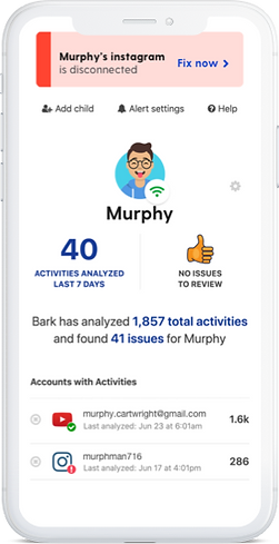
I needed to design a dashboard that would:
-
Display the number of overall activities and issues on the account
-
Show change over time in connected activity and issue numbers
-
Convey the status of each connected account
-
Report frequent contacts
-
Introduce screen time and web filtering controls and settings
-
Visualize the relationship between negative, positive and volume of sent messages
-
List recently installed apps
-
Provide an opportunity to engage with the Bark parent community
Project Process
IDENTIFYING THE AUDIENCE
In the research phase, I examined survey information, cancellation reasons, and the Bark user persona library. Using this information, I broke up my audience into three distinct groups.
My first group, glancers, have the least amount of time to look at the product. They need information as fast as possible, with the highest level of clarity. I wanted to make sure that a glancer could find out the number of activities, the number of issues, and see notifications of broken connections or anything that needs immediate attention all within the first 5 seconds on the dashboard.
I called the second group scanners. A scanner is typically searching for a specific piece of information like recent app installs on their child's phone, or they are looking for an overall view of their kid's digital life. To support scanners, I made sure that all section headlines were clear and succinct. I also wanted scanners to understand any data visualizations without the need for supplemental copy.
The final group is comprised of parents who have ample time and want to know all the information we can provide. They are looking to find the whole story and often are searching for a way to get deeper into the app. They are the deep divers. To support a parent looking for details I made sure that I included breadcrumbs to help them customize their settings, understand how our algorithm works, and provide opportunities to browse the blog or engage with the Bark parent community.

WIREFRAMING
Once the audiences were defined, I could work on achieving their goals with the information hierarchy. I began with breadboarding the experience using text only and identifying how users could enter and exit the experience from various locations, where the dashboard would link out to other pages and assets. I also defined the new elements that I would need to add to the design system. During this phase, I included every idea that I had no matter how out of the box it was. I presented the outline to stakeholders and our engineering team to define what was attainable on our timeline, features that were out of scope for now, and what ideas wouldn't work at all. With an approved outline in hand, I moved on to the fat-marker stage. I used rough hand sketches to finalize section order and basic structure. From there, I began designing in higher fidelity and tasked a designer and copywriter with assets that I needed. I also worked with the dev team to create the new design kit elements and added them to Bark's overall style-guide.
VALIDATING IDEAS
With the approved high fidelity mockups, I created an Invision walkthrough of the product to show to stakeholders and engineers. During the meeting, I explained my decision-making process and talked through everyone's feedback. We talked through my plan for continued growth and evolution, and the scalability of the design. We went through user feedback from a small group session I ran and the results of a poll within our 30k member Facebook group. Once we agreed on the final edits I prepared my handoff documentation and worked with the developers to make sure that the final product matched the approved design.
Results and takeaways
Though the dashboard is ever-evolving with new feature releases and bug fixes the framework that I created has proven to be scalable and easily managed. The number of help tickets that come in relating to dashboard questions has decreased by 39%. Churn also went down 9% though it's important to note this wasn't the only update that contributed to churn going down. The library of elements I designed has been integrated into the design system and now provides the bones for any in-product subpages.
DREAM BIG BUT BE REALISTIC
Initially, the stakeholders and I had some ideas that would provide an enriching experience for users but in talking with the engineering team we realized the proposed features weren't going to have enough of an impact to justify the time needed to code them. The ideas were marked out of scope for the time being but have been listed on a backlog of projects. Going forward from this project I started marking down a ranking of backlogged projects and earmarking time every week to review so that these ideas don't languish and never become a reality.