Design Systems
OVERVIEW
I am a design system evangelist. Not only does a design system ensure that a product has a cohesive and predictable experience across pages and devices, but the design and development time is significantly reduced, allowing for more strategic design thinking. I have created custom design systems from scratch for existing products at Bark and S&P Global, improved existing design systems at Clair and Informa Markets, and have also created custom styles and components that use the backbone of an established system at RentRedi.
Custom systems for existing products
When a product is already in development, as was the case at Bark and S&P Global I first needed to understand how things were being coded. Were there any universal components at all? Were there custom stylesheets for each page? How much time needed to be allotted to roll out a new system?
When pitching a new design system for a company, I would first complete an OGSM (objective, goals, strategies, and measures) document to organize my plan. This document would map out what success would mean and how to measure it at each project stage. At this stage, I would also set out very general timelines (end of Q1, for example).
From there, I would refine plans with stakeholders and start creating the tickets associated with the design work. I would connect those tickets as dependencies for the dev work and work with PMs and POs to create the PRD (product requirements document) to define the functionality of each piece.
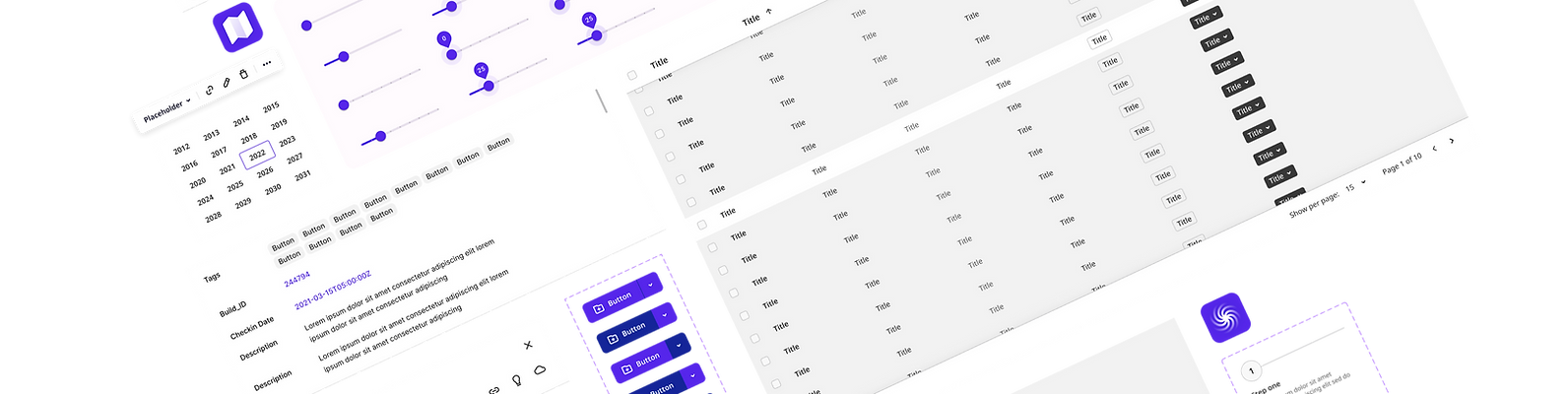
Once tickets were in the system, design work could be done! My first step is always to create the skeleton of the design file - highly dependent on the program being used - and map out how the components would build off of one another. I typically use Brad Frost's atomic design system as a starting point with atoms, molecules, and organisms, then branching into layouts.
After completing the designs for each potential state, I would document any accessibility notes like ARIA tags, alt text, and color notes for dark mode vs light mode. I would also prototype the functionality I was looking for, referring to the PRD, to prevent scope creep and ensure developers understood what was required. After development, I would audit the components, approve or request changes, and make recommendations for change request priority.
This process would repeat for each stage of the project, and along the way, I would measure success by comparing design and development times on new layouts, the number of change requests per feature, and the number of help requests submitted by customers (where applicable).
Improving existing systems
Creating a design system for established apps has its challenges. It's hard to systemize an existing UI because of legacy development and existing customer recognition. Both Clair and Bark were startups that were well into the series A phase when I joined the companies and both had distinct visual voices, however, neither product was especially accessible, and neither product had been built in a systemic fashion.
Clair had multiple types of buttons across the app, and they also had an additional challenge - their app was integrated into existing payroll apps and various places of employement. So users who were onboard to the product needed to know they were leaving their payroll system from the get go, and the Clair messaging needed to be on brand without clashing with the partner company.
The system changes began with design for both Clair and Bark. I began creating components with very few visual changes in my own files and noting their use to dev. Anytime I had a story or task assigned to me for an older piece of the product I would be sure to include my new components in the existing design where it made sense. Slowly I was able to componentize a larger percentage of the app and we were able to make changes without the core functionality being affected.

Custom styles using an existing system
RentRedi was a very busy and growing startup. They didn't have the development capacity for a fully custom design system, but they also weren't really working off of anything cohesive. The solution was to take an existing comprehensive system and customize it to meet their needs.
I began by defining what a system would need to work for RentRedi. They had specific needs, like tables with multiple action options and multi-select fields. They also had general needs like native app compatibility, responsiveness, and accessibility. I created a comparison deck for all the potential systems we wanted to evaluate and test layouts with their stock components. During the evaluation phase, it was decided that Chakra best fit the needs of the product, the users, the developers, and the designers.
I used their Figma kit to begin customizing components' styles and identifying where we needed to develop additional functionality. I got very well acquainted with CodePen and Stack Overflow to research how developers gave their components more power.
Each new design was created with the kit, and each week the design team was responsible for uplifting a few old layouts and adding them to the dev queue.
I audited any new components that designers submitted and added maintaining the library files to my daily routine. Once layouts were live in the staging environment, I would audit them and provide feedback to the devs.
I also monitored success and happily reported that the average design ticket went from 3 days to 24 hours and dev tickets from 5 days to 2 at the end of the first phase.